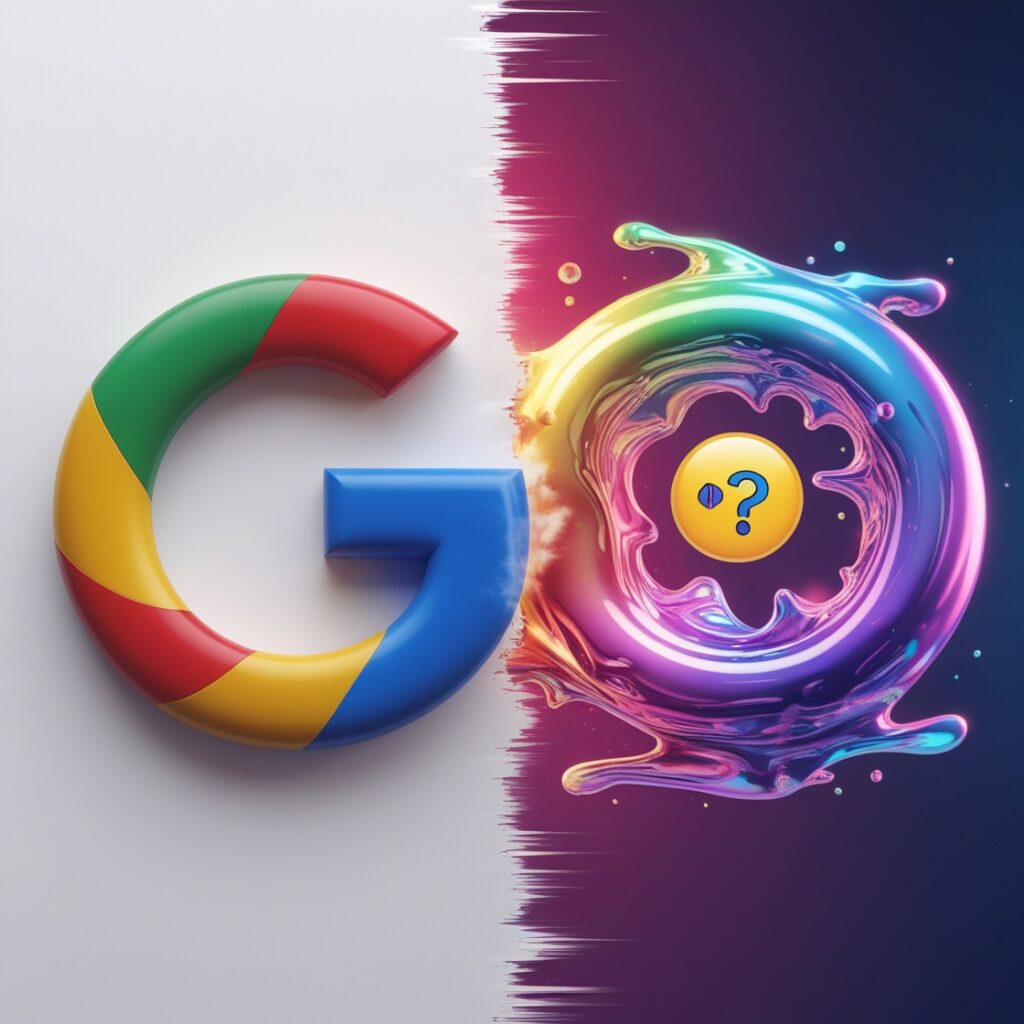
Let me start with this: I don’t trust gradients. Never are the glitter glues of design messy and impossible to scrub off once they infect your eyeballs. So when Google slapped a gradient on its iconic G logo last week, I choked on my cold brew. Again Ten years ago they murdered the goofy lowercase g for that sterile four-colour frisbee. Now let’s unpack why this matters or doesn’t, why you’ll forget about it by Tuesday and why your grandma’s flip phone could’ve designed it better.
Part 1: My Descent Into Logo Madness703 AM Woke up and Checked my phone. Saw the new G on my Google app.704 AM Did I install a bootleg app? Spoiler: No, I’m just paranoid.705 AM Googled Google logo change 2025. The irony burnt like my toast.707 AM Realised it intentionally. Texted my group chat RIP good design.
Why Gradients? Let’s Blame Everything.Gradients are the participation trophies of tech aesthetics. They scream. Look how dynamic we are while hiding the fact that your Google Docs just autocorrected synergy to syphilis. Here is the real tea.
1. Slapping a gradient on the G is like putting a flower crown on a surveillance drone. See, we’re friendly. Ignore the part where we read your emails.
2 Distraction 101 Remember when Google Photos tagged your dog as a potato? Me neither. But the shiny logo.
3 Peer Pressure Apple’s Dynamic Island Microsoft 3D emoji Googles like Hold my 8 lattes. Design Hot Takes From Someone Who Failed Art Class.
The Good
The blue-to-green fade Chefs Kiss It is the colour equivalent of an ASMR video makes me want to buy reusable straws and call myself a UX influencer.
The Bad Red-to-yellow transition Looks like a ketchup-mustard crime scene. Congrats. Google, you’ve rebranded as a 7-Eleven condiment bar. The Ugly The favicon – that tiny G in your browser tab – is now a pixelated Rorschach test. Is that Google?
Image

Conspiracy Theories Because Logic Is OverratedLet’s get unhinged. Theory 1 The gradient mirrors the eye-tracking heatmap of users staring at ads. Oh, you looked at that shoe ad for 03 seconds. Gradient intensifies. Theory 2 It’s a subliminal ploy to make us associate Google with unicorns.
Theory 3 The designer lost a bet. Make the G look like a Lisa Frank trapper keeper, and I’ll Venmo you. 5.The gradient G is pure Windows 98 screensaver energy. And honestly, I am weirdly into it. Fight me in the comments.
Gen Z’s Verdict via My6-Year-Old NieceHer review It’s giving mid. But in a way that is low-key iconic Translation.
The Dark Secret No One’s AdmittingNotice how the gradient ends on blue. Blue trust, blue stability, Please ignore how we are training AI on your Google Docs Classic misdirection. Next, they add a puppy GIF that plays when you mention antitrust lawsuits.
Your Phone Prepare for app icons that look like a melted Skittles bag. Your home screen will resemble a toddler finger painting. Your Job Some middle managers will say Let Google do our branding, and you die a little inside. Your Sanity The G now reminds you that even logos aren’t forever. What next? Your personality Your will to live.
Final Verdict A Love Letter to CynicsDo we need a new G No? Do I hate it? Not really.Is it a desperate cry for attention in the AI apocalypse? 100. But here is the twist. After staring at this logo for 20 minutes, I kind of like it. It’s like a lava lamp for your app – hypnotic, pointless and weirdly comforting.Rating 🌮🌮🌮 3 out of 5 tacos. It’s messy, but I order it twice.
The Day Google G Made Me Question Reality And My Life ChoicesLet’s rewind to last Tuesday. I was doomscrolling Twitter when I saw a tweet comparing Google’s old G logo to the new gradient version. My first thought Did someone spill a smoothie on the design files? My second Why do I still care that people use the word Google as a verb unironically? But here we are. A Brief History of Google Identity Crisis Because Context MattersRemember when Google was just Google? The plucky search engine that didn’t autocomplete your queries with existential dread Let’s take a nostalgia trip. 1998 The logo looked like it was designed by someone who had just discovered Microsoft WordArt Playful Unprofessional The visual equivalent of a startup pizza party 2010s Google grew up. Got a haircut. Traded Comic Sans vibes for the sleek G we all know, one that says we are a trillion-dollar company, but hey, we chill. 2025 Enter the gradient G. It is like if a corporate logo and a lava lamp had a baby.The takeaway Google branding has always been a mirror for its identity. chaotic teen → polished adult → midlife crisis Dad trying VR for the first time. Why Gradients? Let’s Blame Gen Z and My Aunt Carol.I called my aunt Carol last night. She is 62, owns three fax machines and thinks Google is a physical place. Here is how that went: Me Aunt Carol, do you like Google’s new logo? Is that the blue one with the little squiggles? Me, sure. Her It’s nice. Reminds me of that screensaver your cousin installed that gave my computer viruses.Aunt Carol gets it. Gradients aren’t new recycled nostalgia. Gen Z loves them because they retro-read anything pre-iPhone. Millennials tolerate them because they are too tired to argue.
